Fric Frac
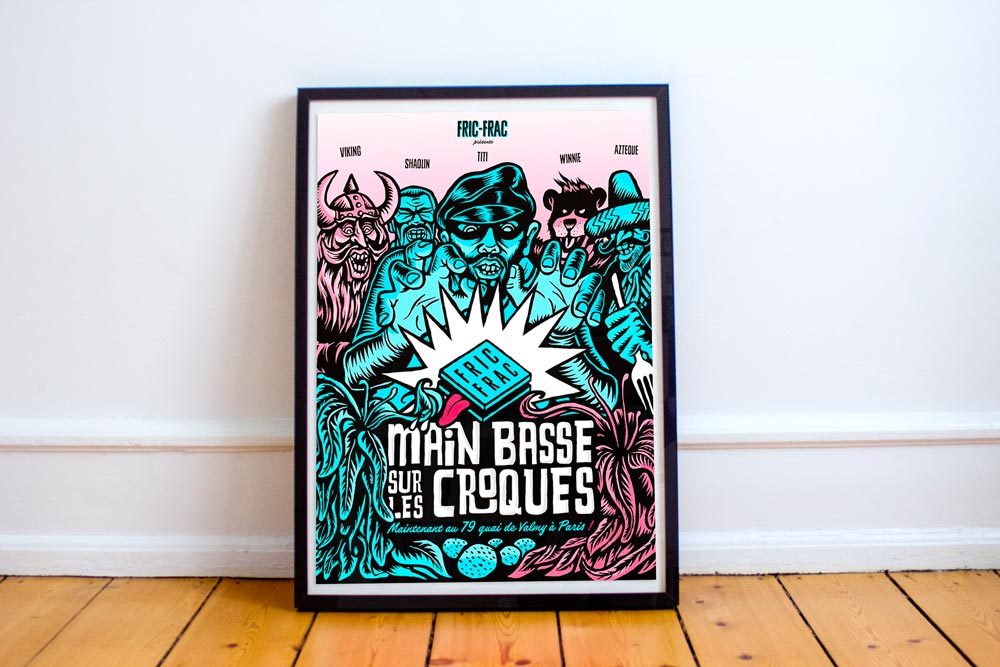
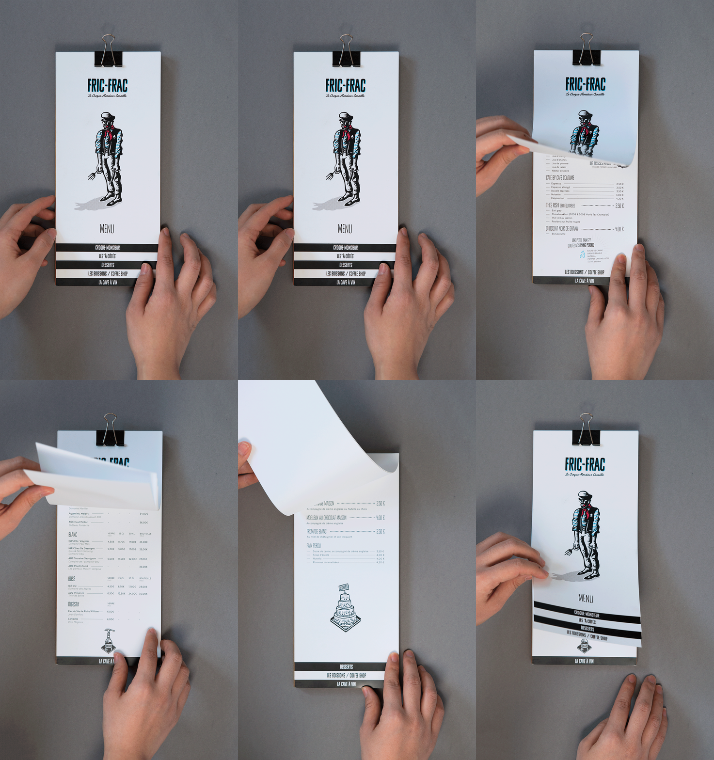
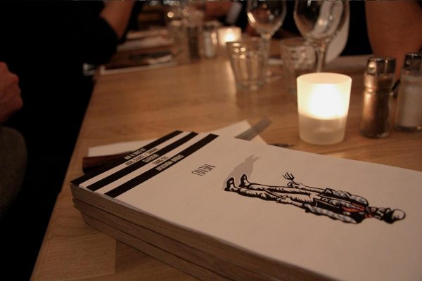
Fric Frac is a restaurant specialized in Croque-monsieur based in Paris. This typical French Sandwich was born in Paris in 1900s.
Fric Frac means “to break in” or “burgle” in the slang of the belle Epoque. That’s the main idea of the project, to dynamite and take back this cornerstone of the Parisian culinary tradition between two slices of bread.
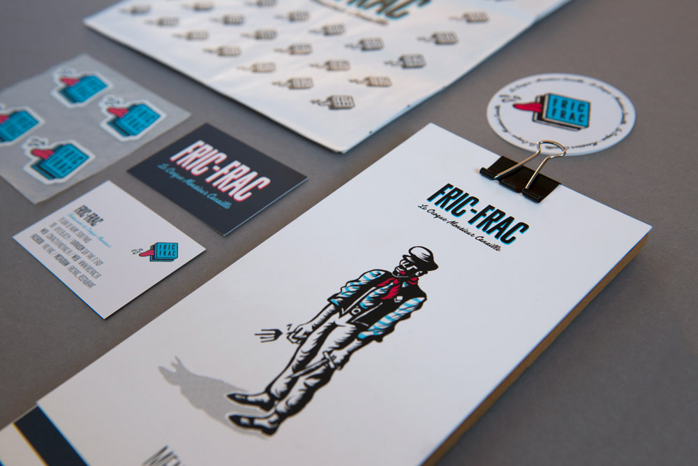
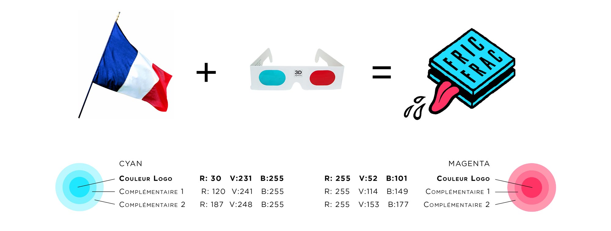
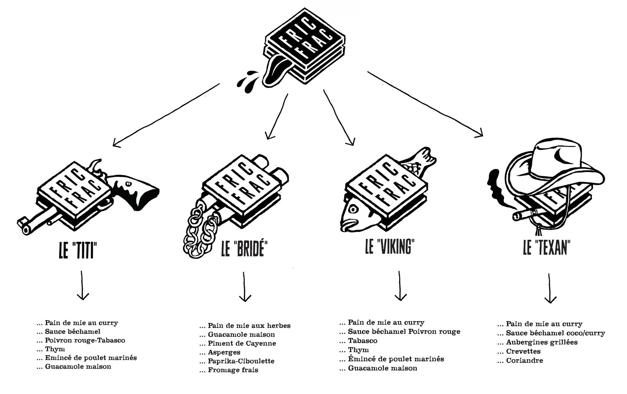
The logo is inspired by the square shape of the croque-monsieur allowing a matrix of fantastic stories.
Client
FRIC FRAC
Year
2016
Mission
- Naming & brand strategy
- Brand visual identity
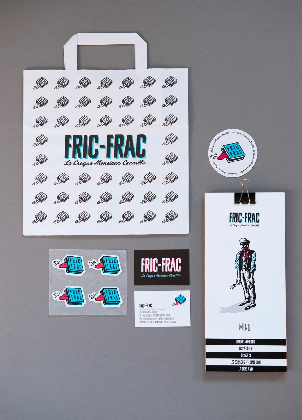
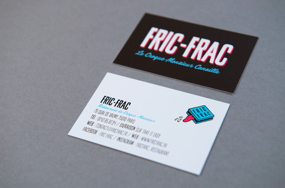
- Print design
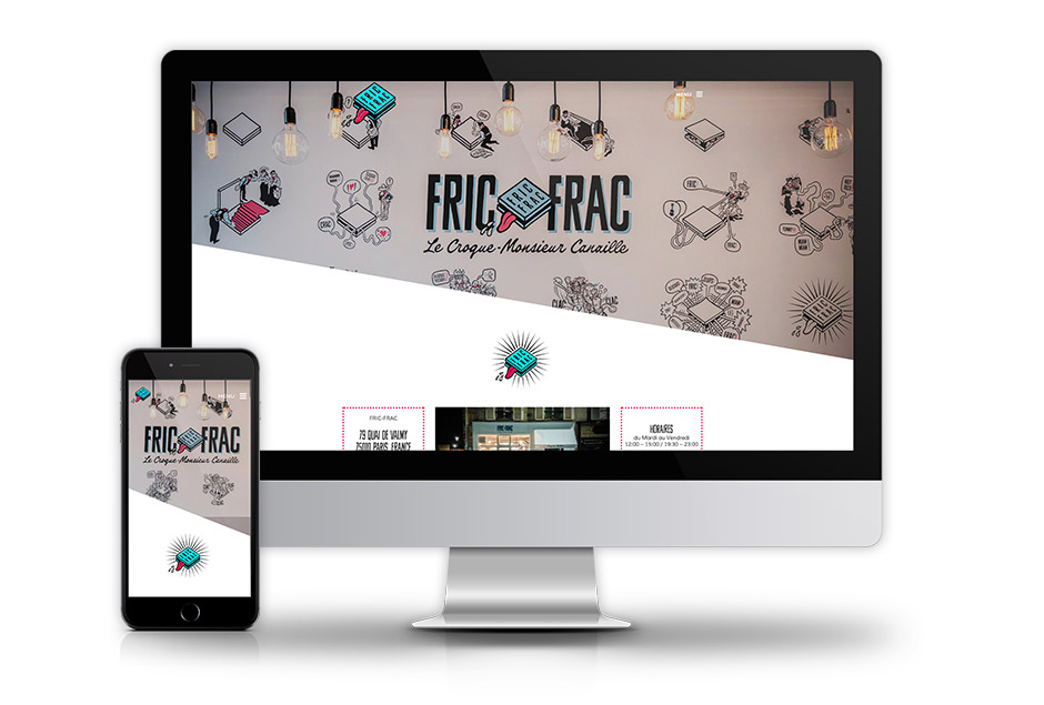
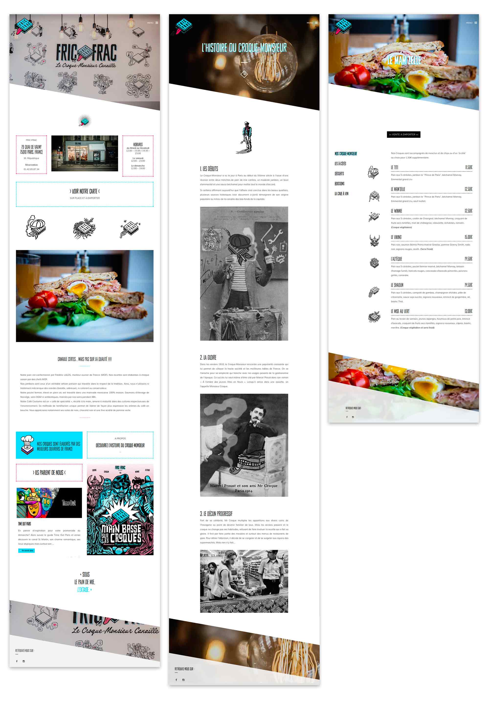
- Web design
- Scenography
Credits
- Graphic design : Marilou Rabourdin
- Photo : Antoine Schoenfeld
Concept

Couleurs
Logo

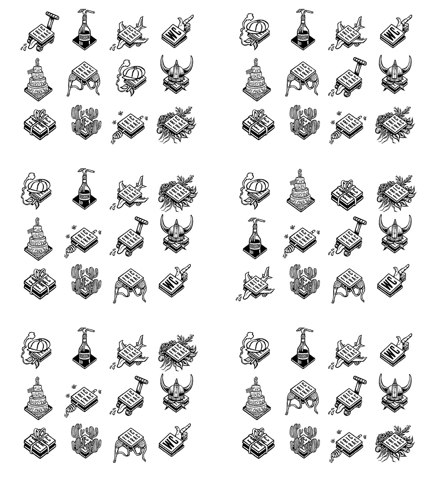
Iconographie
Picto
Web
