Pact & Partners is a worldwide executive recruitment company specialising in life sciences since 1987.
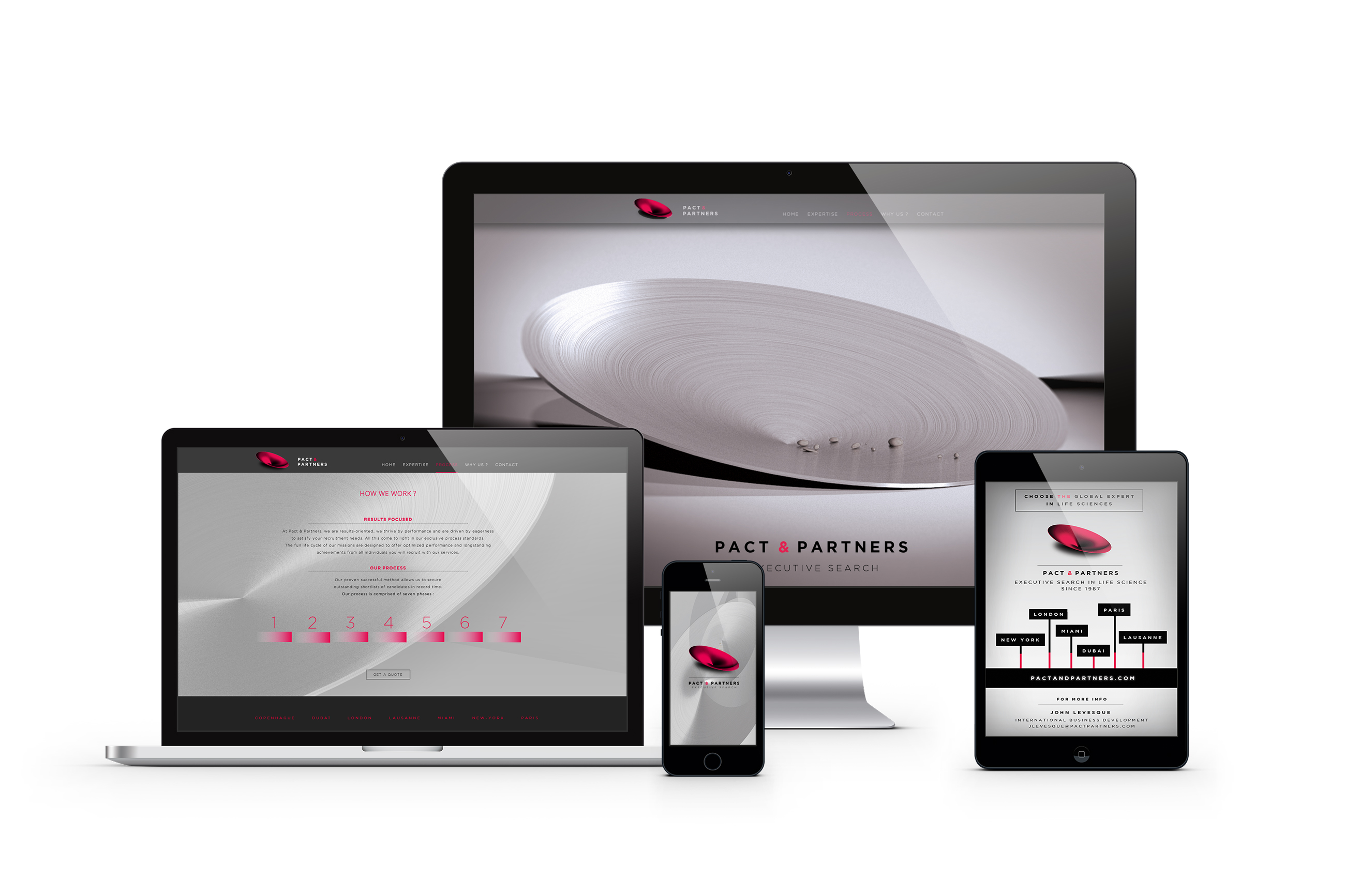
In 2014, the firm wanted to renew their branding to communicate the wide range of their activities. Whilst maintaining some aspects of their current visual identity, we introduced a new creative concept more relevant to the current activity of the company.
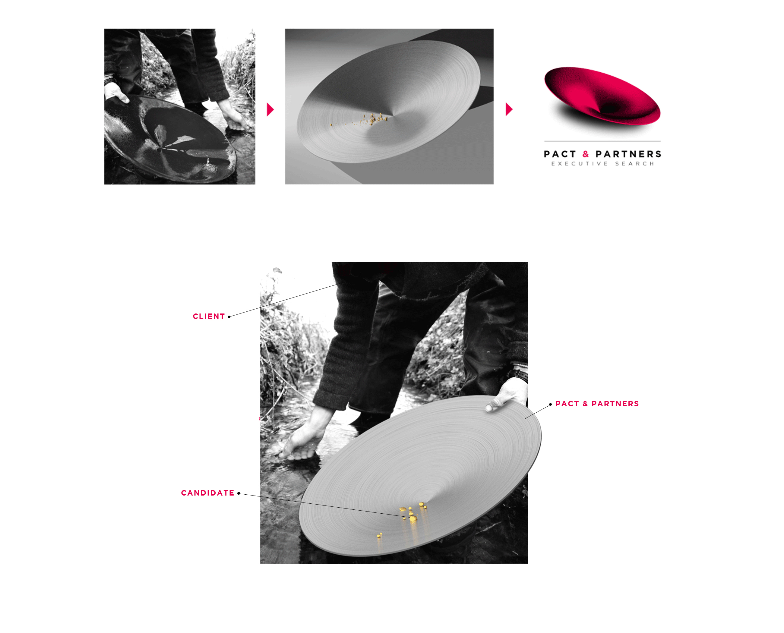
They symbolism of gold panning, a hands-on process to discover and extract precious metals and minerals, was the perfect metaphor to represent the brand values. The visual identity of the brand was created with this symbolism as its cornerstone.
Client
PACT AND PARTNERS
Year
2015
Mission
- Graphic design
- Branding
- Webdesign & développement
Credits
- 3D : Hugo de Gastines
Concept
Web
